Monday, 7 December 2015

Getting To Know People


Task: 


In Groups, produce a presentation on a given Design Studio focusing on the location, strategy, style and unique qualities.

Our given design studio was Wolff Olins. 

'We pit creativity against the big challenges in radically different and radically better ways. Our global teams of designersstrategiststechnologists,programme managers and educators deliver deep, meaningful change across and beyond our clients’ organisations.'

Example of chic company website.


Just a small selection of the hugely successful jobs completed by the company for big name clients.

Thursday, 3 December 2015

Photoshop Induction


In today's photoshop induction I've learnt how to select what elements of an image I would like to use and then apply these elements to another image.

I have used a couple of stock images for practice. Below is an image of the seaside. The only elements I want to use are the bin and the lamp post.

To do this I:


> Changed imaged from background to Layer 0 > Added a mask layer > Made sure mask colours were default Black & White > select Brush tool (Black hides image, white reveals) > Quick Selection tool selects quickly and easily selects objects within an image > Click 'create mask layer' symbol (looks like Japanese flag) and all that will be left on screen is the objects you want to take forward.


I then opened a new stock image of a mountain landscape. 

To insert the two objects from the previous image I clicked Select > select merged > Edit > Copy > Paste onto the new image.


As the lighting of the previous image did not match that of the new image we were shown how to make adjustments so that it doesn't look stuck on and blends in with the background.

Adjust Values 

Image > Adjustments > Levels > adjust the 3 pegs
                                   > Hue/Saturation (Lower saturation is easier to Blend)


Lowering the saturation of both layers makes it a lot easier to blend images


Wednesday, 2 December 2015

Book Design - Colour Theory


For my first book design I will be publishing a small book on Colour Theory. This is a topic that took my interest when we were introduced to it in our Design Skills module. 

Below are a range of examples of how my publication can look...


The subtle, elegant look to this design is what grabbed my attention. With the use of only one colour in a range of tones and only one shape, the designer has produced a really simple yet effective book design. I aim to replicate this simplicity in my own designs.


Again, this book design uses simplicity and minimalism to create a book cover on the topic of colour theory. The choice of hues work well together as well as the amount of white space complimenting and bringing out the imagery.


Specifically, I will be looking into how colours work together, both harmoniously and in contrast.

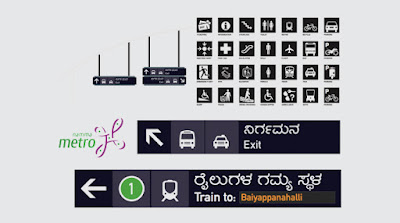
Wayfinding - Typeface & Colour Theory


Wayfinding is an integral part of human existence and has been throughout history. Wayfinding has the function of informing people of their surroundings. 


An effective wayfinding system consists of a number of characteristics that are as follows:

- Do not make them think - create a clear communication system with concise messaging

- Show only what is needed - relevant information to the space or location

- Remove excessive information - remove unnecessary elements and 
keep it clear


Strategic Wayfinding Design

- When creating a signage system for an area or building, strategy is essential as it allows     for a modular system that is adaptable.

- Research is an important step to understand the environment the wayfinding will be used   in.


Signage

There are 4 important types of signs:

- Information signs - a sign with a destination

- Directional signs - helps find/locate a destination

- Identification signs - info about individual locations are displayed

- Warning signs - safety procedures for an area

To make a signage system work together, a design grid is used to order information and to scale the signs to different sizes.


Signage Typeface

- Signage typeface is usually sans-serif type and available in various weights with a simple   easy to read design.

- They have a good legibility with a large X-height and wide letter proportions with                  prominent ascenders/descenders to ensure a good readability.


Be consistent in typography, type height, icons, grids, colour and material choice. The signs need to be straight forward and in a consistent order.


Signage and colour contrast

- Contrast between the foreground and background is one of the most important factors        for the ease of reading.

- If coloured text is used on a bright background the contrast will be weak.

- Optimal contrast results in white text against dark colours.

- Colour programs can distinguish signs from one another and can offer an indication of the message without having to understand the sign.


Arthur & Passini Graph


- This graph explains the calculated contrast difference between two colours

- The formula is based on the light reflectancy in percentages

- Subtracting the darker colour from the lighter one, divided by the difference by the lighter   and multiplying by 100 we get the Brightness Differential

- When the brightness differential is 70% or over the legibility is assured. Anything below       this percentage means it does not have enough legibility to be used.


Examples of Wayfinding around Leeds city centre


Thursday, 26 November 2015

What is a Book??


For my primary research into what exactly a book can be, I've found a number of blogs online. One of them being the 'Book Design Blog'.


Contemporary Japanese Design


Produced by Joe Leadbeater, this publication has taken elements of Japanese design and culture. I admire the considered use of paper, as it is typical of Japanese design with the colour and feel. The combination of Japanese characters and english text works well in cohesion. 
When designing my own book, I will also be considering the paper used. I will also be producing a cover or sleeve for my book as a finishing touch.

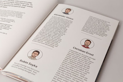
New Eden – A Book Celebrating Great Game Environment Design


New Eden is a book showcasing a selection of hand-picked computer game environments.Each spread features a high-resolution in-game render of a different game environment, plus an iconographic key and a mini-map ‘HUD’ that denotes the genre and environment styles, such as ‘space’, ‘swords’, or ‘apocalyptic’.Quotes from game designers are interspersed throughout, and the book is finished off with a wooden cover and lazer-etched design.
I Love Type Boxset


Each of the 8 publications centres on a particular typeface, complete with modern-day examples of the faces in use, as well as insights from some of the industry’s leading studios and designers.
Finally, all the books are encased within a white box embellished with rainbow foil embossed typography on the outside.


Rekonect Notebook: The Magnetic Lifestyle


This is one of my favourite bits of design. It's a concept for a notebook that is bound with magnets. This allows the pages to be rearranged, pulled out and put back in. The adjustable pages also means that (pictured in the middle) the page can be moved so that writing on it is made easier. Other advantages include it sticking to metal surfaces such as a fridge.