Monday, 30 January 2017

Print Workshop Visit

Belgium Print Workshop

Over the Christmas break I visited Belgium for the first time. Whilst I was there, I managed to find a small print shop in Bruges. I called the phone number I found on their website and arranged a visit. After finding the print shop online, I decided it would benefit my practice if I visited it as I am looking at poster design in a couple of briefs on at the moment. I am looking at poster design for my CoP essay and practical work as well as for my substantial responsive brief.


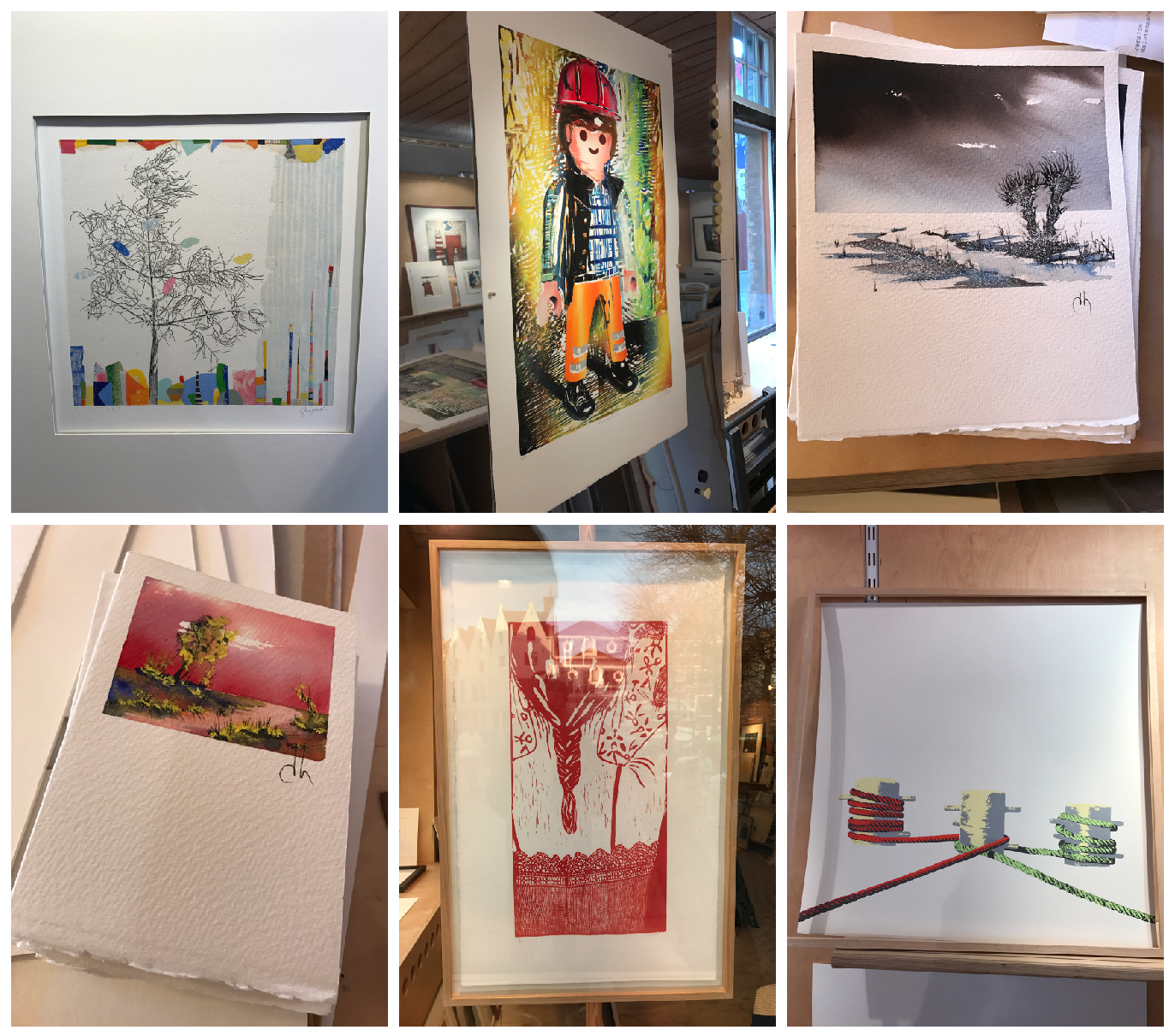
For the substantial brief, I am designing posters and to champion the use of the paper I'll be using, I have aimed to inform aspects of each poster with the texture of the paper its printed onto. So when looking around this print shop, I documented the ways in which the print maker has thought about the colour and imagery in relation to the type of paper its printed onto. 

Some of the prints are done onto smooth, ultra white stocks that allow for the colours to be bright and eye catching and the image is not compromised by the texture or grain of paper. Whereas some others were printed onto more textured stocks such as watercolour paper, this had a huge effect on the overall appearance and quality of image. These were a bit more grainy and the colours weren't as vibrant however the stock gave the image a more traditional, textured look which makes the viewer appreciate and notice the paper more than a normal print stock.


Despite the slight language barrier between myself and the print maker, I decided to ask him some questions about his work and career in print making. He explained to me a few things about his passion for print making such as who his clients are and how he got into it in the first place. He also talked my through the process of producing each print right from finding inspiration for imagery and colour through to choosing stock and size. 

To show my appreciation for him showing me around and answering my questions, I decided to purchase one of his prints.

The experience was very useful for the couple of briefs I have on at the moment that involve poster design. I will be using this research when choosing design/stock/scale etc for designing my own prints.

Saturday, 10 December 2016

Free-Lance Work - A Grade Promotions

My first experiences 

Something that I wanted to experience and develop was to take on briefs set by clients outside of the uni course. Throughout this year I have come across a couple of opportunities to do this and learned a lot from them.

A-Grade Promotions

On my way home from a night out at the beginning of the year, I met a guy who had just opened up a new bar in town and he mentioned that he needed a designer to do some work for him to promote his bar and give it a social media presence so I said that I would do it for him as it would benefit both my practice and progression on the course.

The work involved creating logos that could be used for a number of different purposes as well as cover photos and banners for their social media presence. It was a huge learning curve for me as I had never done real life client based work before and it taught me a lot.

As I was designing for the client, I was also simultaneously chatting to him on Facebook and constantly sending him the work I was producing. He would then give me feedback on what needs changing etc and so I was making changes to his liking.

Overall I really enjoyed the experience as it is valuable for when I leave uni as this will be the type of work I will come across regularly. Learning about how to deal with clients was also very beneficial to my practice and is something I will definitely be doing more of as I progress through the course.

Another reason for why I enjoyed this brief is that I got to see my own work being used by real people all over social media and was something I hadn't yet experienced but is a big part of what we do as designers.


Monday, 28 November 2016

Visiting Proffessional - Only Studios

Only Studios

As we've begun a brief looking at design for screen, Only Studios came to give us an insight into what they do. Only is an award winning strategy and design consultancy that help businesses grow and innovate through design. Their website outlines the process they offer for each of their clients in order to deliver a high quality service, this service is shown below...


Notes from talk : 

- Coding is not an essential skill if you're interested in designing for screen

- Digital design is equally, if not more, important than print 

- An app or website is usually the primary way a user/customer accesses a website/service etc - primary way of consumption

- Digital design is interactive and responsive

- Its here to stay and is constantly expanding

- Endless opportunity, fast paced constantly evolving

Process simplified...

Phase 1
- Research
- Who are the users
- Personas


Phase 2
- Wireframing
- Sketches
- Processes

Phase 3
- Design

Phase 4
- Front end
- Development


This was a helpful first insight into the digital design industry, something I haven't given much thought in the past. I'll be using their suggested process to guide my own project, ensuring I consider all the important aspects of designing for screen.

As well as this, I took not of the fact that they have worked for Sony Music previously and are a regular client of theirs. One of my responsive briefs asks to design a campaign/product/service for Sony Music and so I have emailed them explaining the brief and have asked for some insight that may have otherwise been hard to get hold of about Sony Music as well as any suggestions at to how I approach it.


Thursday, 24 November 2016

Visiting Professional - Harrison Park

Harrison Park

Harrison's background in Graphic Design:

- Was a student at Leeds College of Art
- Now freelances at Studio DBD in Manchester
- Works somewhere else from Monday to Wednesday
- Thoroughly enjoys working Thursday to Friday at DBD as it involves more creative work
- The work he does the rest of the week is a lot less enjoyable but its briefs that pay the bills
> The hard truth about the Graphic Design industry

Examples of some of his work on Behance...


From the three projects on his profile, its clear that he enjoys working with print. 

Notes from his talk:

- Build relationships
   - Social Media
- Sometimes building relationships and networking doesn't work, but just pick yourself up and try again
- Its not handed to you
- Be passionate, be flexible
- Don't be a dick / arrogant - it gets you nowhere. Be confident, theres a big difference
- Don't be afraid to ask questions
   - if people don't get back to you, so be it
- Rejection happens, deal with it
- Stay true to yourself - don't try and please everybody by being who they want you to be, if you don't agree with something make yourself heard
   - if a job isn't right for you, ditch it
- There's more to life out of London - Even though there is huge opportunity there, don't think that it's the only place to be
- Make contacts ! - the most important advice he can give
- find what suits you

- Although quite negative and off putting, it is the nature of the industry and the harsh truth that needs to be known before entering the real world of work. 

- His talk has definitely made me think twice about career paths

- One thing I'll take away from this is the importance of networking and making contacts.  This can make the difference needed in finding a job or freelance work.

- My opinion used to be that you have to almost sell yourself to get somewhere. By this I mean conform to what they want you to be as aposed to being yourself.
    - However, Harrison suggests to stay true to yourself always no matter what and if a job doesn't suit you, so be it.

Monday, 21 November 2016

After Effects Induction

Basic After Effects Skills

As my first experience on software of this kind, at first I really struggled to get my teeth into it, similar to my experience with photoshop.

After a few inductions, things started to make more sense once I learned the basic principles.

In our 3rd induction I managed to produce an animation I can be proud of as well as picking up some useful skills. I will hopefully be able to produce something using this software for studio brief 2, design for screen. Below are some screenshots that I can refer back to later on as a reminder...

The first screenshot is the basic skill of how to compose a new composition... 


The default setting for a document, recommended by the tutor, is to use prest 'PAL D1/DV Widescreen Square Pixel'.


To import any file, shape, sound etc then go to File>Import>File... and import one or more files at a time. It is then easy to drag each file into the document. One thing to remember is that if you import more than one file at a time, make sure to separate the layers using the window that pops up.


An example of my experiments is below. This was just a quick and simple task using a rocket shape. I was just brushing up on what I learnt last week, using the position tool and opacity. I also played around with the anchors on the movement line to create a zig zag.

In order for the shape to directly follow the line, then go to Layer>Transform>Auto-Orient>Orient Along Path... This will make the rocket in this case follow the line on the nose as apposed to staying horizontal. This makes for a more accurate and realistic movement.


Another useful tip I learnt was how to use 'Toggle Hold Keyframe'. This holds the object at a certain point until its told otherwise. This is useful when you want to create a constant loop.


Stormy Weather

For my proudest work yet, I created an animation involving some clouds, rain and lightning. I used all the techniques I have learnt this far as well as some new ones. In this animation, I also introduced sound along side the image, something that may prove useful when I put this into practice in Studio brief 2. 


Thursday, 10 November 2016

Leeds International Film Festival 2016

Film Posters

As part of the international film festival, North Bar in the centre of town is show casing an exhibition full of film posters featured in the festival. Specifically, these posters were selected based on the popularity and recognition of the film soundtrack(s).

As well as being genuinely interested and intrigued into poster design, this also related to my Context of Practice investigations. My chosen essay question focuses on the portrayal of history and culture through the branding of Olympic Games. An important feature of these branding campaigns are the official posters. I thought that going to see these posters would better my understanding into poster design as its something I haven't looked into previously but can see myself gaining a sustained interest.


Interstella 5555
Directed by Kazuhisa Takenouchi, Japan / France 2003

Unique fantasy musical adventure with the animated style of Battle of the Planets. Soundtracks by Daft Punk.

The poster design has clear links to the typical Asian anime style. This is evidenced through the illustration and design of the character that takes up the whole poster. The surreal blue skin, large eyes and defined hair all come together to form a typical anime character.

Designed in 2003, the poster also shows signs of considerations of type setting and typeface with a margin set off centre and text aligned to the right.
Lost in Translation
Directed by Coppola, USA / Japan, 2003

Film about loneliness and melanchony. Two people cross paths in a Tokyo hotel and form an unlikely but heartfelt friendship.

The starkness of the hotel and loneliness they feel is amplified by the ambient soundtrack reflecting the deep sense of nostalgia throughout the film.

The image clearly links to the film title and plot. Scarlett looks lost but in a comfortable and interested way. The backdrop is typical of Japan with busy lighting and narrow streets.
Liff30 on Tour: Stop Making Sense
Jonathan Demme, USA, 1984

Poster design typical of the 80's music culture with the ill fitting suit taking up the majority of the image. The poster tells the viewer that the film is based on a performance of some kind as the figure is posing in a way that a musician would on stage. The black backdrop then highlights the figure putting him at the forefront and focus point of the poster. The viewers eye is then drawn to the bottom right where the name of the film is illustrated.
2001: A Space Odyssey
Stanley Kubrick, UK / USA, 1968

Stanley Kubrick's visionary sci-fi classic is repeatedly voted into lists of top 10 movies of all time. 

"an episodic spectacle featuring balletic sequences of cine-choreography, awesome futurist design, suspenseful action, trippy psychedelia, and a magnificent soundtrack."

The text floating outside of the globe gives a sense of unknown and loneliness.


Drive
Nicolas Winding Refn, USA, 2011

A hyper-stylish, ultra violent cruise through the neon lit backstreets of LA. A masterclass in artfully crafted Hollywood neo-noir.

"Refn's visio of neo-noir doom is fully realised through Cliff Martinez's remarkable soundtrack which blends synth-pop with dark electronic drones to create an impeccably crafted combination of filmic flair and sonic menace."

Ryan Gosling starring as the main role also gets centre stage with this poster design, giving away some clues as to the plot of the film, less ambiguous than others.
Koyaaniqatsi
Godfrey Reggio, USA, 1982

Featuring one of the most icnonic soundtracks in film history by Philip Glass, this film is an audiovisual extravaganza by filmmaker Godfrey Reggio. It was originally screened as an experience in the Radio City Music Hall.

The poster really doesn't give much away. Looking at it, the viewer would have no idea what the film is about, plus the fact the title of the film is an Indian word meaning 'an unbalanced life'.


Movie posters are often redesigned by artists or designers as they feel they can produce a poster that would bring new light to an old film or put a different perspective on things. These posters can be extremely ambiguous to the point where they would have been completely unusable as the official poster. 

I've made the decision to produce posters for a couple of modules. This is something I am genuinely interested and will be looking into contacting poster designers for my PPP interviews.


Wednesday, 9 November 2016

Lighting Induction

Advanced Flash Lighting


As I had recently finished my publication I utilised the lighting induction and brought my book along with me. I wanted to gain a better understanding of the lighting equipment before I take photos for submission and my online portfolio.


We were taught how we can manipulate the lighting to get different sorts of photos. The two main ones are beauty and pack shots, these differ mainly in depth of field.

I played around with lighting in order to get the right balance of shadow, colour and warmth. 


I also tried to convey the texture of stock through close up imagery.