Thursday 26 November 2015

What is a Book??


For my primary research into what exactly a book can be, I've found a number of blogs online. One of them being the 'Book Design Blog'.


Contemporary Japanese Design


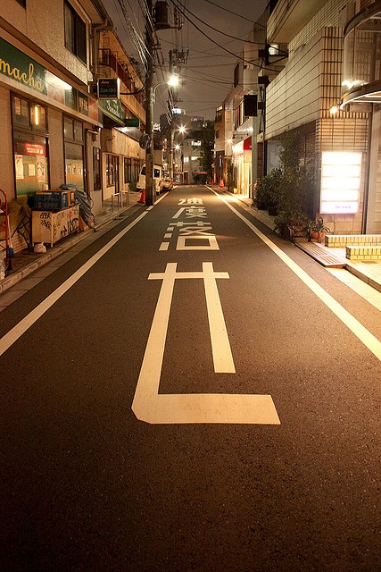
Produced by Joe Leadbeater, this publication has taken elements of Japanese design and culture. I admire the considered use of paper, as it is typical of Japanese design with the colour and feel. The combination of Japanese characters and english text works well in cohesion. 
When designing my own book, I will also be considering the paper used. I will also be producing a cover or sleeve for my book as a finishing touch.

New Eden – A Book Celebrating Great Game Environment Design


New Eden is a book showcasing a selection of hand-picked computer game environments.Each spread features a high-resolution in-game render of a different game environment, plus an iconographic key and a mini-map ‘HUD’ that denotes the genre and environment styles, such as ‘space’, ‘swords’, or ‘apocalyptic’.Quotes from game designers are interspersed throughout, and the book is finished off with a wooden cover and lazer-etched design.
I Love Type Boxset


Each of the 8 publications centres on a particular typeface, complete with modern-day examples of the faces in use, as well as insights from some of the industry’s leading studios and designers.
Finally, all the books are encased within a white box embellished with rainbow foil embossed typography on the outside.


Rekonect Notebook: The Magnetic Lifestyle


This is one of my favourite bits of design. It's a concept for a notebook that is bound with magnets. This allows the pages to be rearranged, pulled out and put back in. The adjustable pages also means that (pictured in the middle) the page can be moved so that writing on it is made easier. Other advantages include it sticking to metal surfaces such as a fridge.


Creative Signage & Wayfinding


Another idea I have had on what to explore for my wayfinding brief is road markings. At first, road markings seem incredibly dull and unimaginative, which is mostly true. However, there are some examples I have found that take a much more creative approach to it. 


This is a very clever way of combining 2D and 3D design. From this I could design road markings of my own that combine the two mediums. This design focuses less on practicality and more on humour and aesthetics.


This is a unique system of wayfinding using thick painted strips of colour guiding the user to each destinations effectively and easily. This is a really effective system of wayfinding as it physically leads the user to their desired location without any user error. The user simply needs eyes and feet to use it.


This is an installation at the Plaza del Torico in Spain. This examples is less about finding a location as the lights don't actually lead anywhere but it is a good idea for a wayfinding system. As well as looking aesthetically pleasing, the main advantage of this system is that it is hugely effective at night time, A lot of signage around today have the disadvantage of not being legible in the dark without a light shining on it, e.g. road signs and road markings.
I can use this in my own project by coming up with a system that works effectively in both light and dark environments using light and/or reflectors.


These are examples of road markings in Asia. What i like about these markings is the characters and typeface used. The lettering is a lot more clean and structured than road markings in this country. In my project, I will be considering the typeface used as well as the method in which the markings will be applied. This method will have a strong influence on the outcome in terms of cleanliness and other aesthetics.


These images above are examples of what I aim to fix. The reason I took an interest in road markings is because, during my primary research walking around Leeds, I noticed that all the road markings seen all over the country are very effective but they don't have enough consideration for the quality of aesthetics as thus there are faults, mistakes and rough edges. I aim to smooth out these rough edges using alternate typefaces and methods of application.


Taking influence from all the examples of creative wayfinding systems, I will be producing my own to work in a specific environment. At the moment, my interest falls in road markings so i will be exploring the environment of roads themselves and how the wayfinding can be creatively designed. 


Tuesday 10 November 2015

Ai Weiwei at The Royal Academy


 Ai Weiwei at The Royal Academy, London


My recent visit back home to London included a very inspiring and influential visit to one of my favourite exhibitions to date; the work of the world renowned artist Ai Weiwei.

Ai Weiwei is not only a contemporary artist but an activist also. He has been highly critical of the Chinese government's stance on democracy and human rights. Because of this, he is a very controversial figure in China and was once held for 81 days in small room watched by two guards 24 hours a day without any official charges being filed. 


What inspired me most about this amazing exhibition was the careful consideration into the materials and processes used to create and form these structural masterpieces. At first some of the work may not seem as ore inspiring as when you find out where the materials were sourced from and how they were sourced. This is why the audio guide is crucial in fully understanding and engaging with the work.


This piece is made up of thousands upon thousands of steel rods, sourced from the rubble of the devastating earthquake in China in which thousands of people were killed. The Chinese government did not do enough, in Ai Weiwie's eyes, to help the people affected by this natural disaster and so it inspired this sculpture. There is a TV mounted on one of the walls of the exhibition hall that shows how each metal rod was hammered by hand at least 200 hundred times to straighten it out. He describes this piece as a way of remembrance.


The names of all the people killed by the earthquake were written up on two walls facing each other, surrounding the sculpture pictured above. It shocked me how many of the names had birth dates very close to mine which made it that little bit more real.


The two images above show a sculpture made out of rubble that Weiwei collected when his newly built work space and gallery was demolished. In January 2011, a demolish team turned up to his studio and completely tore it down in the space of a day. Ai Weiwei left convinced that it had something to do with his political activism.


 The piece shown on the right is a series of marble sculptures laid out in rows. These marble sculptures are tufts of grass, remnant of the park Weiwei would push his little son through in a push chair. There is then a push chair, also made out of marble, situated in the left corner. This push chair is simply an example of excellent crafting skills. Marble is extremely brittle making for a very difficult material to work with.

The image above on the left is part of a series of boxes, roughly 4 x 2 metres. Inside these boxes are scenarios from when he was captivated by the government for 80 days in solitary confinement. Two guards stood over him all day and all night and he was fed basic rations. The only light source was a dim lightbulb. This confinement was obviously a scare tactic to put Ai Weiwei off activism.

I thoroughly enjoyed this exhibition as it wasn't only about aesthetically pleasing pieces of art work that are simply nice and interesting to look at, but it was more about the materials used and the story behind those materials. I was blown away by so much of it and it left me wanting to find out more about his life and the events which have inspired his work. The little insights into his life in China are simply amazing and make you want to be part of it.


Saturday 7 November 2015

Typefaces with a purpose


Most, if not all, registered typefaces have been designed with a specific purpose in mind. Each detail of every typeface has an informed reason whether that is communicating a message as clearly as possible or to convey a memorable aesthetic. 

Dyslexie is a typeface designed to aid dyslexic people in reading and writing, designed by Christian Boer. Dyslexics rotate, invert, exchange or shift letterforms around in their head. Dyslexie makes it easier to distinguish between characters through inconsistent widths and shapes allowing each letter to stand out on its own and not be confused with other letters.


Ecofont is designed to reduced the amount of ink needed to print it by simply reducing the surface area of each letterform, effectively turning the typeface into swiss cheese.


Cisalpin is a typeface designed specifically to work for cartographic uses, e.g. on a map or atlas. The font is cleverly designed ing being narrow and space-saving as well as legible at different sizes, thus making it a perfect front to use on a map.


DPCustomMono is a slightly more complicated typeface designed for proofreading. The emphasis of the typeface is on optimal character recognition which allows text to be scanned, read by a computer and converted into an electronic format. This font is also useful in converting text into speech to aid the blind. It is designed specifically to optimise letterform and glyph differences.


Trace is font designed for helping kids learn how to write. Made up of dotted lines, it creates guidelines on which children follow with pen or pencil. 


Isotype is a universal pictographic language designed to be understood by anyone anywhere in the world. It used familiar images to communicate different aspects of life.


Some typefaces can even be designed, not only with a certain purpose in mind, but also a specific place. Chatype was designed for a place called Chattanooga and aims to reflect their 'artistic and entrepreneurial culture'.


The last example I'll talk about isn't exactly a typeface nor does it have any practical uses. It is a humorous take on the ambiguous scribbles that you often find on a prescription from the doctors.


The purpose and reason for why a typeface has been designed is hugely different for quite a few typefaces. Some are designed purely for practicality and help legibility, readability etc where as others aim to communicate something, whether it be an image, an idea or something even more obscure.