Thursday 25 February 2016

The People's History Museum - Manchester


Show Me The Money //


exhibition at the peoples history museum in Manchester

To kick start research and development of the brief 'License to print money', we took a trip down to Manchester to see an exhibition on the history of money.

The gallery wasn't the largest I had ever seen and so the contents weren't as excessive or impressive as I imagined. Despite this, I managed to photograph a sufficient amount of work that will influence my design decisions.


Simon Roberts
Graphs, 2012

Simon Roberts presents a series of 56 graphs taken from newspaper reports about the financial crisis of 2008. With the axis removes, it is impossible to tell what they signify, yet line graphs are used by journalists to signify a sharp downturn, or a transformation of fortunes.

I am very fond of this series of drawings as they are incredibly simple in form but within the context of the gallery, it is easy to distinguish a few meanings for each of the squiggles. The differentiating stroke weights, lengths and sharpness of peaks makes for an interesting set of drawings that work well together.


Stock Ticker

A stock ticker printed company names followed by stock price information on ticker tape. The term 'ticker' came from the noise made by the machine as it printed. Paper ticker tape was slowly replaced in the 1960s. Yet the concept of the live stock ticker lives on in the scrolling electronic tickers seen on brokerage walls.

I found this machine interesting as it is a traditional printing method used by brokers. As we have been asked to demonstrate traditional printing methods within this brief, this machine is very relevant to the brief. If i could get hole of a working ticker, this could be a perfect method for producing designs, however I don't know how difficult it might be to find one.


I am not 100% sure what the illustrations above represent however what I have taken from it is the freeness in strokes and its unique illustrative design. The work is very busy and hectic which may imply that it has something to do with stocks as they are very high tempo. It includes faces of important presidents and prime ministers, past and present along with intertwining lines and text.


Peter Fluck
Inflation Trap, 1970s
Ink on Paper

The 1970s saw rising levels of inflation that were combined for the first time with increasing unemployment. This was known as 'stagflation or the 'inflation trap'. Here Peter Fluck shows John Bull, the image of Britain, hanging on to money despite the fact that it was assumed to make the economic problems worse.

I really like the style of drafting in Peter Fluck's work and I feel it adds some intensity and emotion to the already slightly distressing imagery. The drawings very cleverly add severity to the message using facial expressions and harsh stroke weights and cross hatching.


Stefanos
Defacing the Euro, 2015

In reaction to his countries major financial crisis, Greek artist Stefanos has figured out a novel way to express his dissatisfaction with EU-imposed austerity and greedy corporate fat cats, by defacing the euro.

This work gave me an idea to not design a whole new currency but to deface or manipulate an existing one to communicate a certain topic or problem etc.


Illustrative art work

Above are some more examples of work that caught my eye. I have documented mostly illustrative pieces of work as this is the style I will be aiming for in my own designs. I will be combining a number of traditional methods to produce a banknote. These methods may include monoprint, etching, drafting, water colour paint etc.


Thursday 18 February 2016

Secret 7 - Design Development


Ear Rings //


Dyring my research, one aspect of the artist's appearance that stood out for me was her heavily embellished jewellery, in particular her ear rings. 

Image result for etta james       Image result for etta james   

I've taken the design of the ear ring shown above and drawn it in illustrator in it's most simple form using only circles.

What resulted was a really clear and simple design that I can use in a number of different design ideas.
Next I wanted to experiment with stroke weight, colour and shadow. One idea was to have only the shadows cast by the jewels onto a blank sleeve. However, I could not get the jewels to be 3D to then cast a shadow so I was not happy with how it turned out.


The design in the middle is the ear ring with a very soft sky blue to fill. This gave me one idea to screen print it using clear ink. This would result in a design that would only be seen when light bounces off of it and therefore be more ambiguous.


From my research into Graphic Design in the 1960's, in particular the Psychedelic 60s, I have implemented the common colour schemes used in that time.

Colours used in the Psychedelic 60s often were very contrasting with combinations like orange and blue. They are also very loud and strong colours like reds and pinks. These colours stem from the fact that a lot of the design during that time was based on imagery seen when people were 'tripping out'.


Similar to my pattern design used for the screen prints, I decided to produce a repeated pattern using the ear ring design. The repeated pattern idea stemmed from the fact that the actual record consists of 3 versus and a chorus which is then repeated a couple of times.


For the sleeve to be more 'psychedelic' I have added more colour to the background and on the left I have enlarged the design to fill more of the sleeve. I have used similar colours for the foreground and background as it makes it more difficult to distinguish and therefore makes for a more 'trippy' effect.


Out of all the designs using the ear ring, the one above is my favourite. It includes the whole ear ring design and uses a range of psychedelic colours and the white background in the centre allows for the design to stand out more as well as being framed. With all that combined, I feel as though this design would be more eye catching amongst the other designs.


Earlier today I submitted my final designs to the competition.

My chosen designs are shown below...

 I chose the designs that I think will stand out amongst the rest if they were to be printed out and placed on a shelf. 


Wednesday 17 February 2016

Preparation of Digital Positives


Screen Print Induction Workshop //

Today was an introduction into how to prepare my own images to be used in a screen print…


Specifications of document:

Page Size A4 (unless a larger screen is wanted)

NUmber of Inks: 2

Important: for this induction artwork should have no tonal variation


Context

A positive is a black and white laser print that is used to transfer an image onto the silk screen


Instructions

Prepare either Photoshop pr Illustrator artwork using two layers - each layer only containing 100% black - this will be used to print a positive that will apply one ink. Print using a Black and White Laser Printer.

(don't use a colour laser printer or an inkjet printer)

note: The following are possibilities and are intended as helpful tips, there are many other techniques that can be used.


Using Photoshop

Prepare each colour on its own layer


The yellow ink will print on top of the blue ink, the inks will mix on the paper making a third colour. If we do not want this to happen, we must remove (knock out) the blue from ‘underneath’ the yellow.

One way to do this is: Hold the Command key and click on the yellow layer in the layers palette.


This will select all pixels on the yellow layer. 


Now to fill each layer with Black - First, check the ‘Lock Transparency’ button for each layer


Using Illustrator

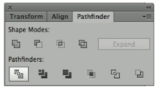
Prepare artwork with each colour on it’s own layer. Again, you may want to remove (knock out) one colour so that inks don’t mix during the printing process. Try the “Pathfinder” filters - Divide (results will vary according to your artwork.)


Then select all objects on each layer, fill with Black and Print each layer individually. 


Wednesday 10 February 2016

Screen Printing - Part 02


My first real go at Screen Printing //


As part of the live Secret 7 brief, I decided to experiment with more traditional methods of print. 

At the start of the day I didn't have much of an idea of what I was doing. I have screen printed before but it was a while ago and it didn't grab me at first.

After being shown how to prepare my screen, it was ready to expose my images.

I designed a pattern based on some of the imagery taken from the lyrics of the song. The song reads 'My heart was wrapped up in clover'


To prepare the screen, I had to design the pattern in black. Any of the black ink would then show up on my prints and anything left blank would be white.

One problem I came across was that in order to do a two colour print, I would have to have two different versions of my design. One version should only include the hearts and the other the clovers.

To tackle this I cut out the pictograms I didn't want to show up on two separate designs. This meant that I could then repeat the process again afterwards and fill in the missing design.


Above is my prepared screen with both versions of the design on it. I have started by taping over the clovers as I printed the hearts onto my stock first. The tape over the clovers prevented any unwanted ink coming through onto my stock.


So that I could line up each attempt in the same position I used a layer of translucent paper and printed onto it. This then allowed me to gage where it would print onto the page.

After a few attempts, the design started to come out more and more faded. After asking why, I discovered that it was because the ink had dried a little on my screen. This will be due to the fact that I didn't know exactly what I was doing and so took me longer. To solve this, I had to clean the screen and try again. This time it worked a lot better.


I have produced a number of outcomes so that I can choose the best one to submit. It also gave me a chance to test out the second layer of colour.


Adding the second layer of colour worked perfectly. I managed to line them up so that it replicated the original pattern.


As the brief asks for a record sleeve design, I have traced the net of a sleeve and made both a positive and negative. I will then use this to cut out my design and produce a sleeve.


Tuesday 9 February 2016

Screen Printing - Part 01


Repeated Pattern //


For one of my sleeve designs I will be experimenting with screen printing.

I will be printing a pattern made up of imagery from the lyrics of the song. To create a repeated pattern I will be experimenting with the two shapes I have used earlier in my designs; The Heart and the Clover.

[insert drawings]


I've first designed two simple pictograms using the same stroke weight. The pictograms should be legible at a number of different sizes.


I plan to screen print this pattern onto a sleeve. To do this I have filled in the pictograms so that they come out successfully when they print. I haven't screen printed in a while and and not sure which of my designs will come out best so I will be experimenting with a number of them. I have kept the designs simple to minimise any human errors. 

The design decision to use a traditional process like screen printing came about due to my research into design in the 1960s. A lot of what I found had clear characteristics of traditional processes. Computers were hardly used during that decade which shaped a lot of the design decision. Hopefully, through using screen printing, I will replicate the feel and appearance of 60s design.


I will hopefully add some colour to the screen prints. The colours will be strong and vibrant to match those of the psychedelic design.