Studio Brief 02 - Self Branding //
One aspect of the way I like to work is that I very much prefer working by hand primarily before moving onto digital software like photoshop and illustrator. I have always been a drawer and painter from a very young age and often try to use this as best I can throughout my work.
With a lot of the course requiring Adobe apps, I sometimes find it hard to fit in any hand rendered work. However, I see my skills in drawing as one aspect of me as a designer that could make me unique. It is something that I can work on and grow into my own style of design.
From this I have had a self branding idea. The idea is to produce business cards that include key info such as contact details and maybe one or two other details. However, what makes these cards different from others is that it primarily will not include my name or initials on it. This is because, wen I had over my business card in person to who ever wants it, I will have a pen or pencil handy and will scribble down my name or initials on the card in front of them. This will give the card a personal touch and will show the receiver that it's not just a card I had lying around in my pocket but instead I've taken the time to personally sign it. As well as the personal touch, I also aim to communicate my hands-on, hand rendered attributes and way of working through the business card.
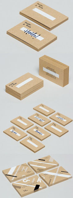
Husler & Rose
Pictured below is one of my favourite examples of how business cards can be made personal but using hand rendered type. Their design is very simple and simply includes their company name followed by a blank rectangle in which they can insert a message to their client.
Research into personal business cards has brought my attention to the images below. The idea is of a stamp that prints my business card onto any surface. This is a very hands-on approach to self branding and promoting and one that would definitely be noticed more successfully and have a lasting impact. It also means that it can be printed onto other surfaces, a business card can be easily lost or misplaced, however depending on where it is printed, the stamp can be a much more permanent thing.
An alternative way of stamping would be a deboss stamp pictured below. This is a cool alternative that wouldn't require inking.
Watercolour logo design.

This is an example of how medias like painting and drawing can be combined with digital software to create personal branding.
This has inspired me to do something similar with either watercolour or pencil. I will aim to create an identity, like the one above, that communicates me as a designer and as a person.
This designer has combined 3 of his biggest interests to produce one of his concept ideas for self branding. This is a good way of using multiple interests to promote yourself as apposed to just being a designer. Adding the photography and snowboarding elements makes it a unique branding to that person.
For my own branding, I will also be communicating my love for skiing and the mountains as well as showing my drafting skills and other hands on medias.


